


Training
New Training Available: Receipt Offset in Assortment Plan
In this quick course, you’ll learn how Receipt Offsets pull receipts in weeks before launch—and how that flows through to Recommended Purchase Orders, Adjusted vs. System Receipt Dates, and your order cycle cadence.
Head over to Toolio Academy: New Feature Training to learn more!
Merchandise Planning
Tooli Insights is Now Available in Merchandise Financial Planning
We’ve expanded Tooli Insights to support the Merchandise Financial Planning (MFP) module, allowing planners to ask performance and planning questions directly within their workflow.
Tooli automatically detects the module you are working in and responds using the relevant data. When you're in MFP, Tooli analyzes MFP metrics such as sales, receipts, inventory, and plan variance to generate insights.
What you can do
Ask questions in the context of:
- Performance & Variance
- Planning & Forecast
- Inventory & Receipts
- Conversational follow-ups: hierarchy (division, department, class), scenario, metrics
Real-time scenario analysis
You can now create a new scenario and immediately ask Tooli questions about it, without waiting for data refresh cycles.

Assumptions & current limitations
- If no scenario is specified, Tooli assumes the Master scenario
- If no timeframe is specified, Tooli assumes the last season (last 13 weeks)
- Derived metrics are not yet supported (planned for a future release)
- Extremely granular queries requiring very large data retrieval may return a performance protection message
👉 Read more about Tooli Insights
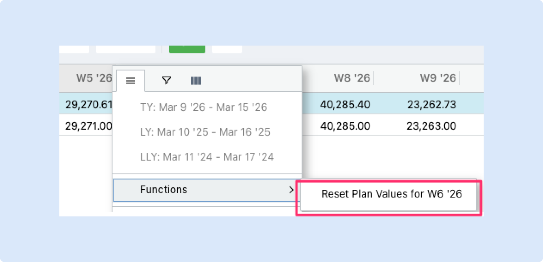
🔄 Reset Plan Values
You can now reset all plan values for a specific timeframe — like a week or month — back to zero, directly from the column header.
What you can do
- Reset an entire timeframe at once – Right-click a column header (when timeframes are in columns), then select Functions > Reset Plan Values to zero out all plan values for that period.
- Start fresh before re-planning – Use this when you want to redo a month from scratch or before copying values from another period.
Why it helps
- No need to manually clear cells one by one — reset an entire week or month in two clicks.
- Makes it easy to re-plan a period or prepare it for a copy-paste from another timeframe.
Share Private Scenarios in Merchandise Plan
You can now share private MFP scenarios with other users in Merchandise Planning.
Previously, private scenarios were only visible to their creator. With this update, you can collaborate more effectively by granting access to specific team members, without making the scenario public to everyone.
What’s new:
- Share private MFP scenarios with selected users
- Assign access as Viewer (view-only) or Editor (can make changes)
- Maintain control over visibility and collaboration

This makes it easier to review, align, and iterate on plans while keeping sensitive work scoped to the right audience.
👉 Read more about Scenario Planning
🌱 Seeding for Daily Merchandise Plans
What's new
You can now seed a Merchandise Plan that uses a daily calendar — filling it with data from another daily MP as the starting point for your plan.
What you can do
- Seed your daily MP – Open the Seed dialog on any day-level Merchandise Plan and populate it using data from another daily MP.
- Choose a daily MP as your source – When your target plan is daily, the source selector shows only Day Level Plans, keeping your options relevant and clean.
Why it helps
- Saves time when starting a new daily plan — no need to manually enter values from scratch.
- Keeps your seeding workflow consistent: the same Seed dialog you already know now works for daily MPs too.
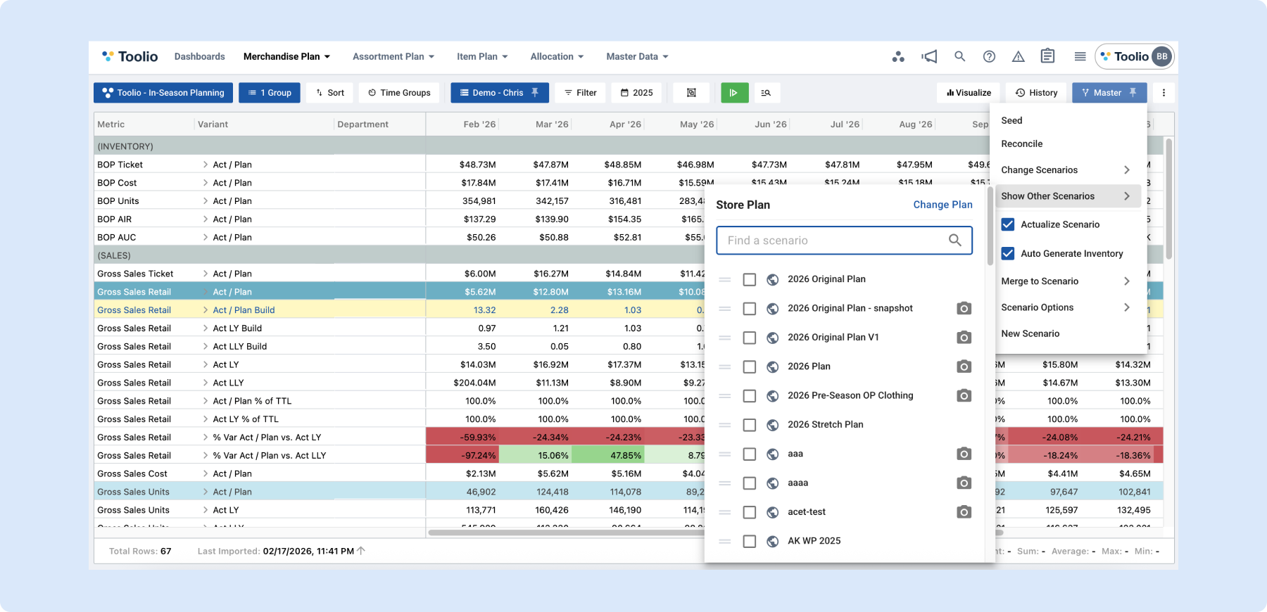
Compare Multi Plan Scenarios without Reconciliation
You can now compare Merchandise Plans across multiple plan scenarios without running reconciliation.
This update makes it easier to evaluate different plan options side by side and quickly understand their impact on key metrics and variants.
How it works:
Go to the Scenarios menu in the top right corner.
- Select Show Other Scenarios.
- Click Change Plan to switch between Multi Plans.
- Select the scenario you would like to compare again.
Once selected, the relevant plan-scenario metrics and variants will appear directly in the grid, allowing you to review and compare them in one place.
This enhancement gives you more flexibility to explore alternative plans and make faster, more informed decisions.
Assortment Planning
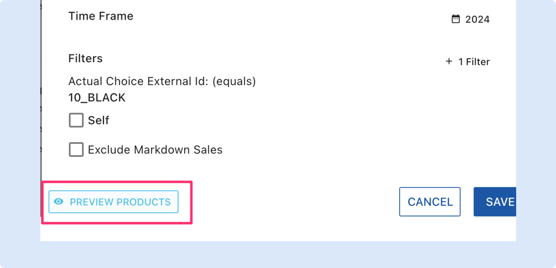
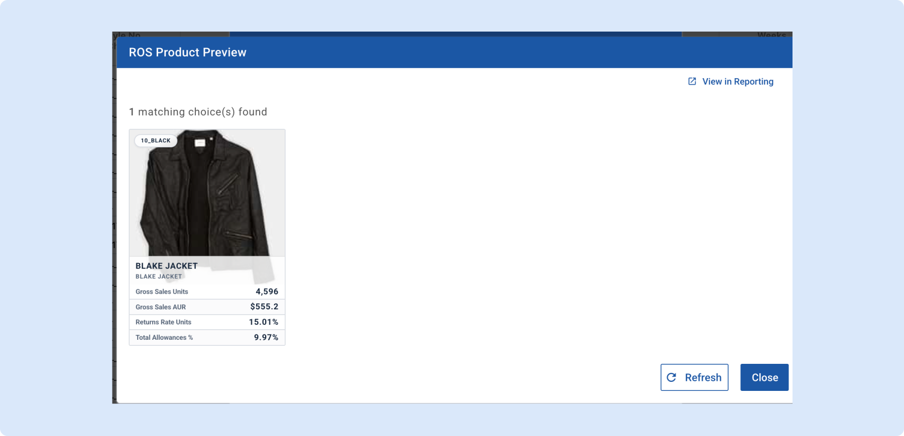
🔍 Rate of Sale Product Preview
What's new
You can now preview exactly which products are included in a Rate of Sale calculation, right from the ROS model dialog — no guesswork needed.
What you can do
- Preview matching products – Click "Preview Products" in the ROS model dialog to see a gallery of all choices that match your current filters and timeframe.
- See key metrics at a glance – Each product card shows gross sales units, AUR, returns rate, and total allowances so you can validate the inputs driving your ROS.
- Preview a single row – When viewing ROS for a specific choice, the preview automatically narrows to just that product.
- Jump to Reporting – Click "View in Reporting" to open the full Assortment Reporting view, pre-filtered and grouped by the same choices, for deeper analysis.
Why it helps
- Understand what's behind the numbers — see the actual products driving a Rate of Sale value before you commit to a plan.
- Catch filter mistakes early by verifying that the right products are included.
- Move seamlessly from ROS review to detailed reporting without re-entering filters.
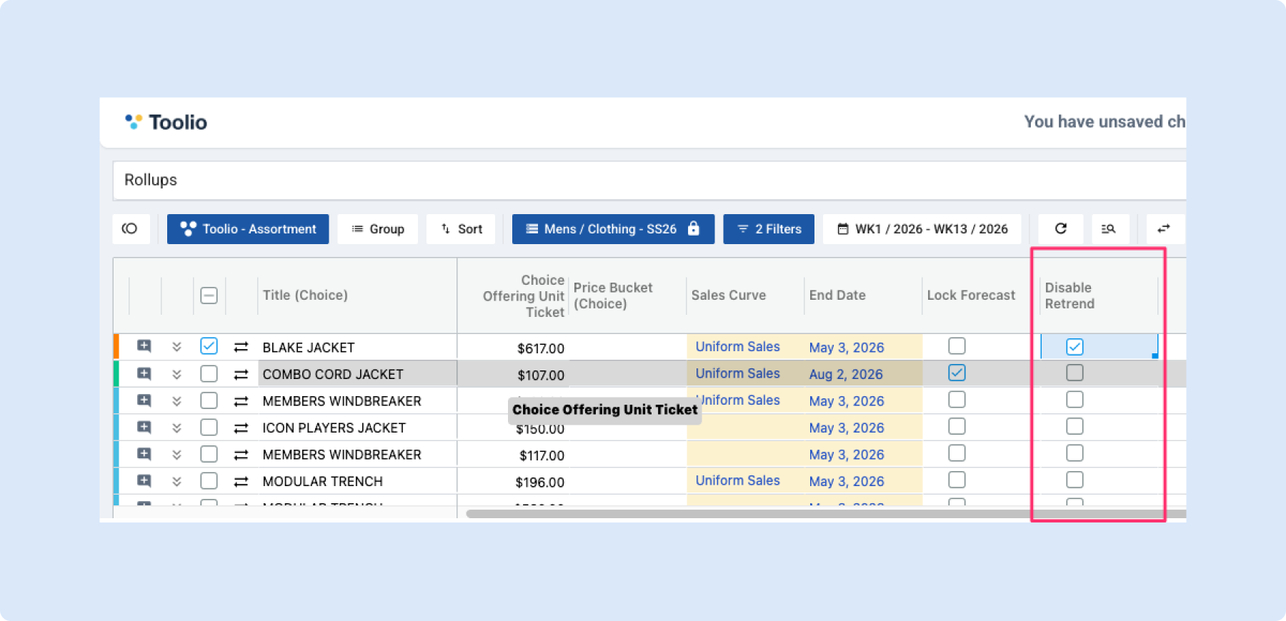
🔄 Disable Retrend per Choice
What's new
You can now turn off retrending at the choice level in Assortment Planning. A new "Disable Retrend" checkbox lets you control which choices get retrended and which ones keep their original forecast untouched.
What you can do
- Turn off retrend for specific choices – Uncheck the Disable Retrend checkbox on any choice to stop retrending from adjusting its forecast. The system removes retrend changes and preserves your original forecast as-is.
- Re-enable retrend anytime – Check the box again and the system picks retrending back up for that choice — no need to redo anything.
- On by default when Retrend is active – If Retrend is turned on, new choices come with the checkbox already selected so your current workflow stays the same unless you decide to change it.
Why it helps
- Fine-tune your forecast at the choice level without turning off Retrend for the entire plan.
- Keep original forecasts intact for specific choices where retrend adjustments aren't needed.
- Quickly toggle retrend on or off per choice as your planning needs evolve.
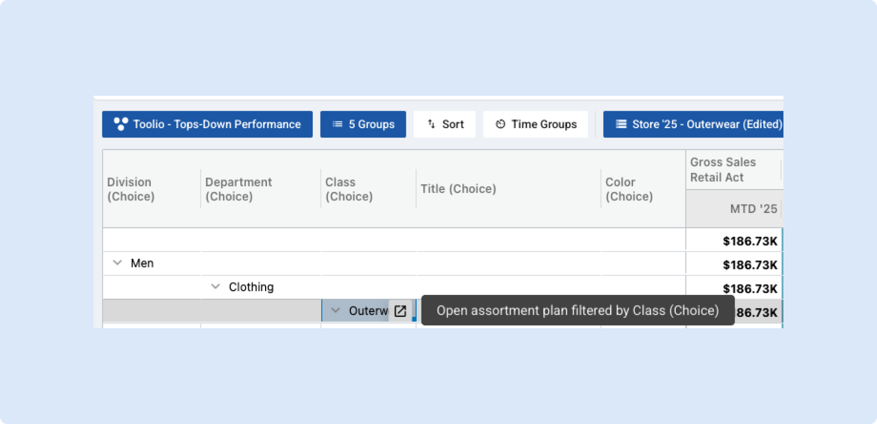
🔗 Assortment Plan Reporting to Line Plan Deep-Link
You can now jump straight from Assortment Plan Reporting into the Assortment Plan with one click — filtered to the exact attribute you were looking at, with your date range, scenario, and other options carried over automatically.
What you can do
- Click through from any attribute column – Hover over a choice attribute cell (e.g. Division, Department, Class) in the Reporting grid and click the link icon to open the Assortment Plan filtered to that value.
- Keep your context – Your current Reporting dataset options (date range, scenario, etc.) travel with the link, so the Assortment Plan opens in the same state — no need to re-select filters.
- Open in a new tab – The Assortment Plan opens in a separate tab, so you don't lose your place in Reporting.
Why it helps
- Go from seeing a number in Reporting to exploring the plan behind it without manually recreating filters.
- Works the same way as the Allocation Plan → Allocation Strategy deep-link you may already be using.
- Saves time when you need to drill into specific attributes across Reporting and the Assortment Plan.
Below is what it looks like in action
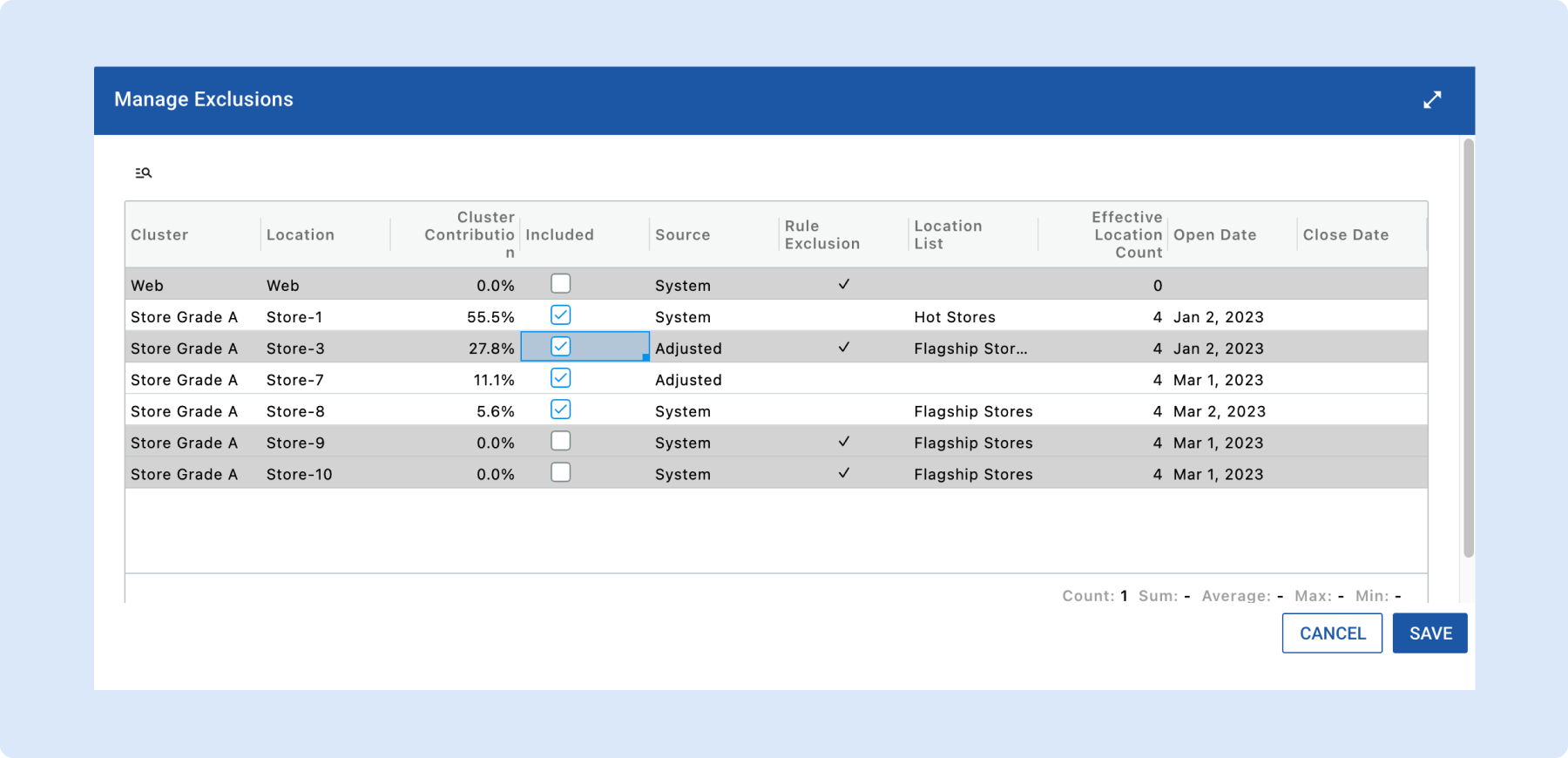
Location Exclusion Improvements
We’ve made location exclusions easier to manage and understand.
Override Location Exclusions
- You can now override a location exclusion rule.
- This allows you to include a location even if it’s excluded by a rule.
Simplified “Manage Exclusion” Dialog (AP)
- Removed redundant checkboxes.
- Removed the separate “Location List Rule” column.
- If a rule exists, you’ll now see the rule name directly.
- If blank, no location list rule applies.
New “Source” Column
- Shows where the final inclusion/exclusion state comes from.
- System → driven by system rules.
- Adjusted → manually overridden.
- Example: Excluded by rule → Source = System, Manually included → Source = Adjusted
👉 Read more about Location Exclusion
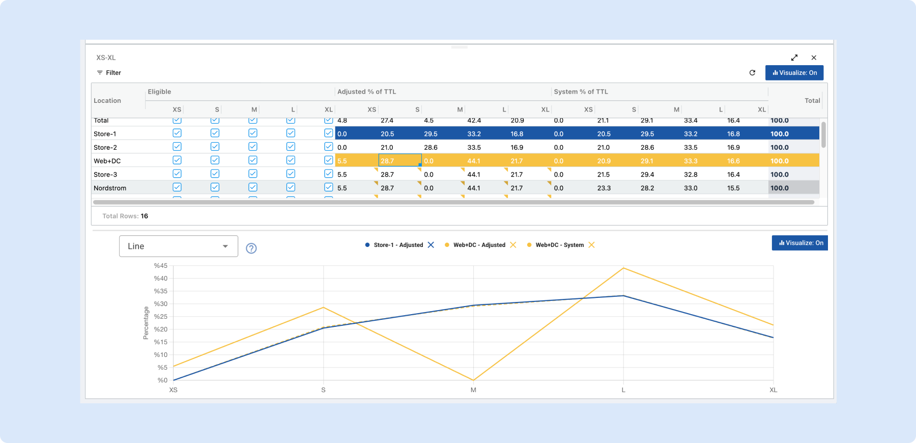
Size Curve Visualization
What's new
You can now visualize your size curve spread in a chart, in the same way you can for Sales Curves.
What you can do
- See size curves in a chart – Turn on visualization to view size distribution (e.g. Adjusted % of TTL) as lines in a chart next to the grid.
- Choose what to compare – Click any row (including Total) to add it to the chart; click again to remove it. You decide which locations or Total to compare.
- Match chart and grid – Rows that are in the chart are highlighted in the grid with the same color as their line(s), so you can see at a glance which rows the chart is showing.
- Less clutter when Adjusted = System – When Adjusted and System are the same for a row, the chart shows a single line. When they differ, you see both (solid and dashed) so you can compare.
Why it helps
- Compare size curves across locations or vs Total without leaving the spread view.
- Spot differences between Adjusted and System when they exist.
- Keep track of what’s in the chart via the colored row highlights in the grid.
👉 Read more about Size Curve Visualization
Choose How Many Cards You See in Gallery View
You can now set exactly how many product cards you want to see in the Gallery View under Assortment Plan > Reporting. Toolio will automatically and progressively hide peripheral information so that images remain front and center, giving you a clean, visual-first experience.
How it works
* Set Cards per Row: Select 10 / 15 / 25 / 50 cards in view selectors
* As you show more cards, Toolio simplifies what’s displayed on each card so the image stays dominant.

Gallery View cards are now clickable
Click any card to open a close-up and view that product’s individual metrics.

Why you’ll love it
- Great for quickly scanning a launch calendar or reviewing assortments by cluster — you get a visual overview and can drill into any product instantly.
- Cleaner, more consistent gallery layouts that put imagery where it matters.
No setup required — just choose the count in Gallery view and go.
Item Planning
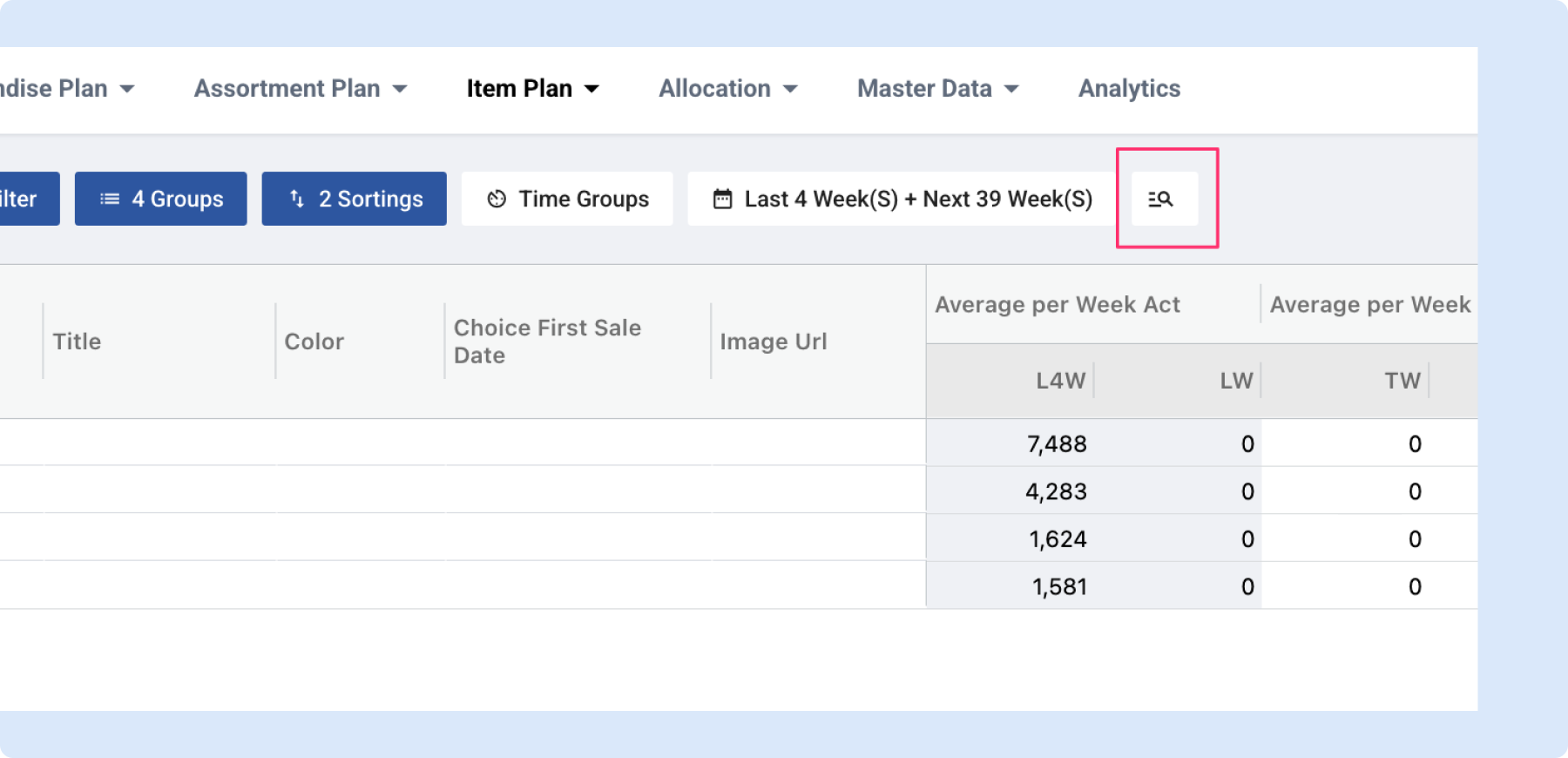
🔍 Quick Filter in Item Planning
What's new
You can now quickly filter rows in Item Planning when you're viewing totals — the same quick filter you know from Merchandise Planning is now available on the IP page too.
What you can do
- Filter rows instantly – When you have "Show Totals" selected on a row group, a quick filter appears next to the timeframe selector. Type to narrow down the rows you see in the grid.
- Works the same as in Merch Planning – If you've used the quick filter in Merchandise Planning, it works exactly the same way here.
Why it helps
- Find specific rows faster when working with large datasets in Item Planning.
- No need to scroll through hundreds of rows — just type and the grid narrows down to what you need.
Note: This capability is only enabled when either Totals is selected in Group By or when Metrics are in the columns
General Platform Updates
Image Resizing - Performance Improvements
Thumbnail images were being rendered using their original full-size versions, which meant browsers had to download and hold much larger images than necessary. We’ve fixed this by properly resizing images for thumbnail display. This reduces the amount of data downloaded and lowers browser memory usage and run more smoothly.
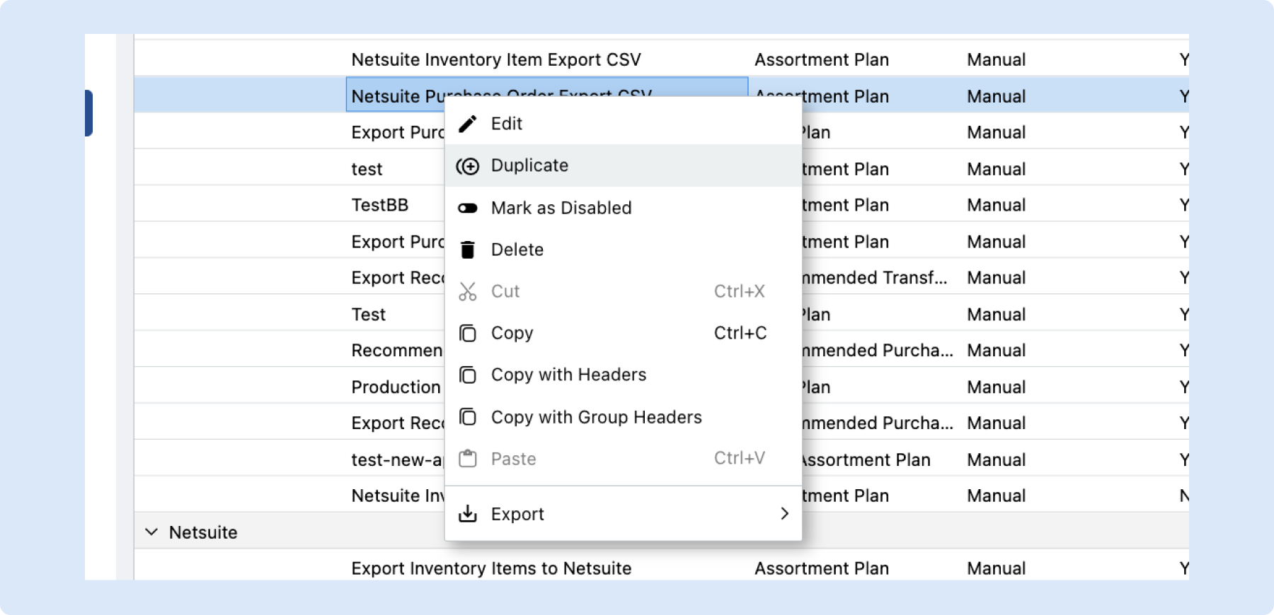
📋 Duplicate Exporter Configurations
What's new
You can now duplicate any exporter configuration with a single right-click. Instead of rebuilding an exporter from scratch, just select "Duplicate" from the context menu and get an exact copy — mapper, filters, integration details, trigger frequency, and all — ready to tweak.
What you can do
- Duplicate any exporter – Right-click on an exporter configuration and select "Duplicate" to instantly create a copy with all settings carried over.
- Start from a working setup – The copy includes everything from the original: mapper, filters, integration details, and trigger frequency. Just rename it and adjust what you need.
- Find it where you'd expect – The "Duplicate" option sits right in the context menu next to Edit, so it's always one click away.
Why it helps
- Save time when setting up similar exporters — no need to configure everything from scratch.
- Reduce errors by starting from a known-good configuration instead of building a new one manually.
- Easily create variations of an exporter for different scenarios (e.g., different filters or schedules) without re-entering shared settings.
Calculated Attributes
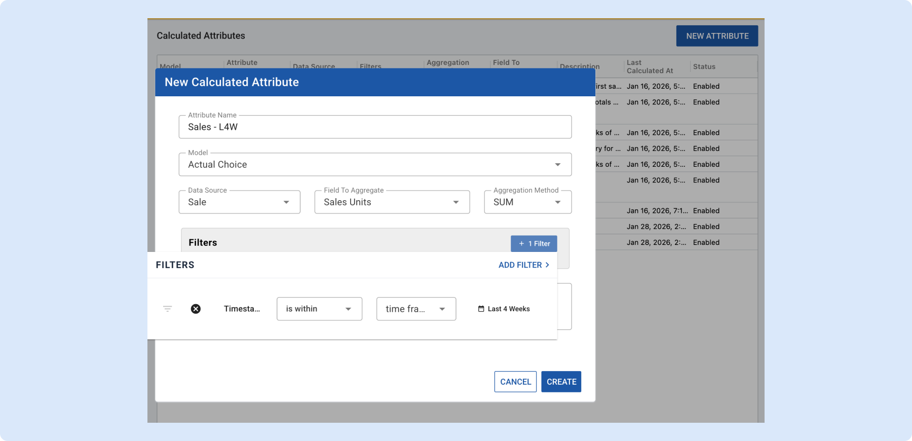
We’re excited to introduce Calculated Attributes, a powerful new way to create custom attributes directly inside Toolio, without relying on the dev team.
This feature gives the users more autonomy by enabling self-serve insights across Sales, Inventory, and Receipts.
What You Can Do
You can now:
- Create custom attributes using Sales, Inventory, or Receipt data
- Apply filters (time range, channel, inventory thresholds, etc.)
- Aggregate fields using Sum, Average, Min/Max, First/Last, Count, and more
- Attach calculated attributes to:
- Variant
- Location
- Actual Choice
Examples:
- First Sale Date
- Last Sale Date
- Avg Weekly Sales
- First Receipt Date
- Last OOS Date
Once created, calculated attributes can be:
- Used in planning modules
- Exported like standard attributes
- Viewed in Assortment Plan (via Attributes menu)
Where to Find It
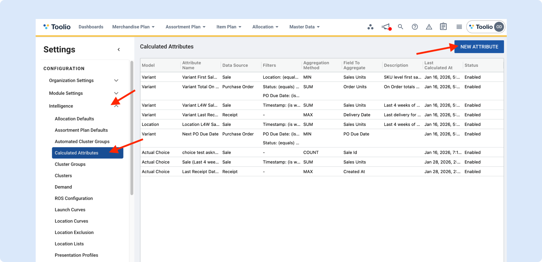
Go to:
Settings → Intelligence → Calculated Attributes
From there, you can:
- Create a new calculated attribute
- Define filters and aggregation logic
- Trigger an immediate recalculation if needed
What’s Coming Next
Planned enhancements include:
- Purchase Order (PO) table as a source
- Booking table as a source
- Multi-source calculations (e.g., Sales + Inventory)
👉 Read more about calculated attributes
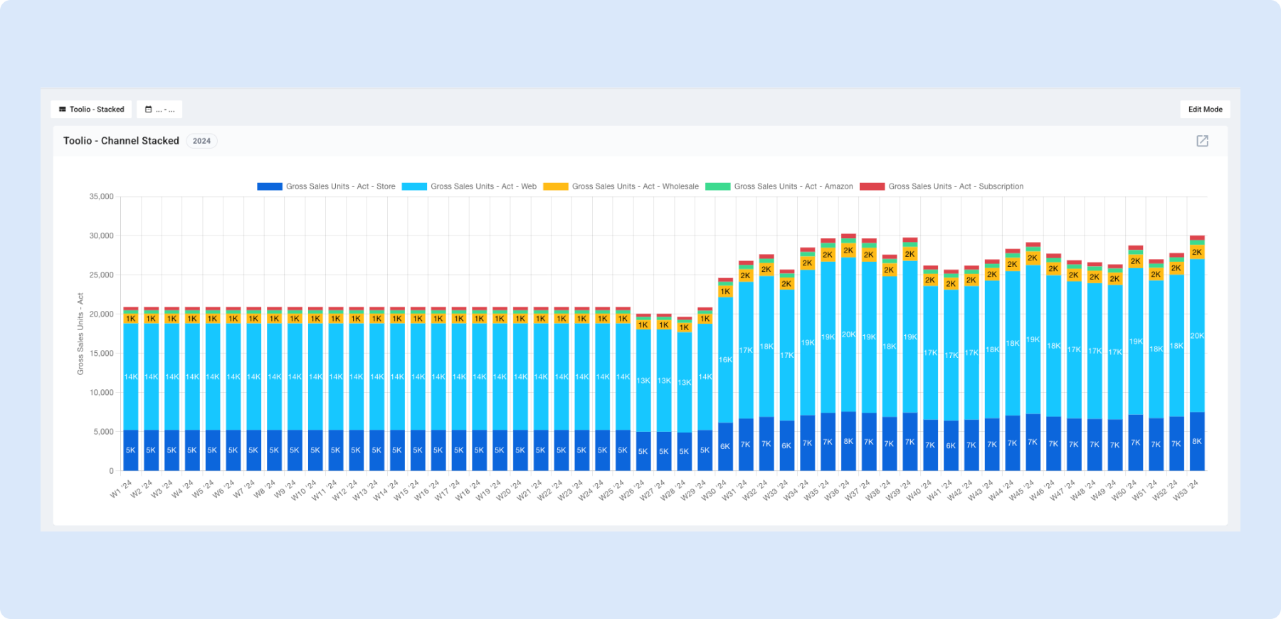
📊 Stacked Chart Widgets on the Dashboard
What's new
You can now view chart widgets as stacked charts. When you group by time (e.g. week or month) and also include attributes (e.g. location or channel), the chart shows each time period as a single bar or area made of segments—one per attribute—so you see both the total and how each part contributes.
What you can do
- Turn on a stacked view – In a chart widget, choose a metric and add both time grouping (e.g. Week, Month) and attribute grouping (e.g. Location, Channel). The chart will show stacked bars or areas: each bar is one time period, and the segments are the breakdown by that attribute. You get the total at a glance and the split in one chart.
- Choose how segments look – When the chart is stacked, you can pick a Color Palette (e.g. Toolio Default, Colorblind Safe, Warm, Cool) and a Treatment (transparency) so each segment has a clear, distinct color. Helps compare various metrics, e.g. Plan vs. Act.
- Read the chart easily – Stacked bars can show the total on top of each stack, and value labels only appear when there’s enough space, so the chart stays readable.
When to use it
- Totals and breakdown together – Use a stacked chart when you care about both “how much in total over time?” and “how much from each location (or channel, etc.)?”. One chart answers both.
- Share of total over time – See how each attribute’s share of the total changes across weeks or months—e.g. which locations are growing or shrinking their share.
- Fewer separate series – Instead of one line or bar per location and a crowded chart, use stacking to keep one bar per time period and compare segments within it.
Why it helps
- See totals and breakdowns by attribute in a single view, without switching filters or widgets.
- Spot trends by attribute (e.g. which locations drive growth) while keeping the overall timeline clear.
- Keep charts readable by stacking segments and using clear color palettes instead of many overlapping series.
👉 Read more about chart widgets
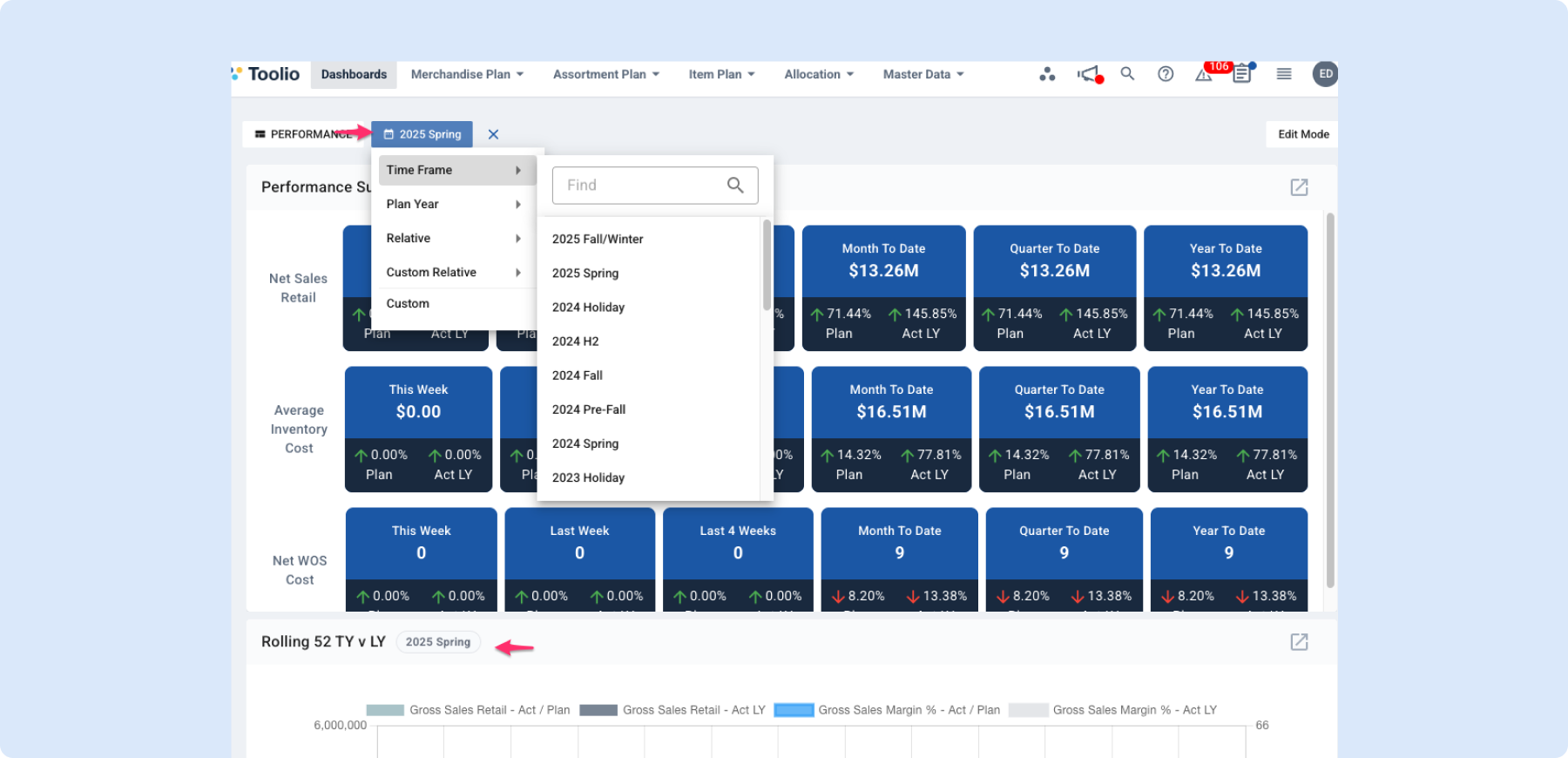
Timeframes on Dashboards
Overview
You can now select a timeframe directly on your dashboard and instantly see your widgets update to match that period.
Key Benefits
Faster Answers, Less Manual Filtering
- Pick a timeframe once and apply it across your dashboard, so you can evaluate the same period everywhere without repeating setup.
- Move quickly between periods (for example, this week vs. last week or this season vs. last season) to spot changes sooner.
Better Context at a Glance
- Widgets now show the timeframe being used, so it is easier to understand what each number or chart represents.
- This reduces confusion when sharing dashboards in meetings or reviewing results with cross-functional teams.
Smoother Collaboration
- The selected timeframe is retained in the dashboard link, so shared views stay aligned for everyone opening the same dashboard.
- You can clear the timeframe at any point to return to your default dashboard view.
What This Means for You
Dashboard analysis is now more consistent and easier to compare over time. You can focus on decisions faster because all your key widgets can be viewed in the same business context with fewer clicks.
Finally below is what it looks like in action!
Need Help? We're Here for You!
Our support team is always ready to assist you. If you have any questions about these updates or need help getting started with new features, don’t hesitate to reach out!
Is there a feature you think would be a great addition? Let us know here!
